Over the past 8 months the digital team have been working on creating a reusable design pattern library to help create consistent ways to design and implement user journeys. As a council we offer a variety of different services, and it’s important that they are consistent in how they are provided to build trust and familiarity between our services. We want to offer a consistent user experience and creating a set of common design patterns enables us to do that. So, whether someone is requesting a dropped kerb or a replacement bin, they receive a good user experience. Having a set of patterns also means that the design team don’t have to create something new each time as the patterns are reusable and instead, we can concentrate on creating good user journeys.
What are design patterns?
Patterns can be a way to ask users for information, such as their name, address or date of birth for example, but they can also be helping users to do something, such as check, book, or pay for something. Components are the reusable parts of an interface, such as checkboxes, buttons or text inputs and various components can be used in multiple patterns depending on the context. A pattern can consist of one or multiple components.
When developing these patterns, we discovered that some of the components we were using had inconsistencies in style and behaviour and this became confusing when designing user journeys. Reusable patterns would help us to design and create journeys with more clarity so that designing and prototyping could become faster and more efficient.
We wanted the patterns to be user tested so that we could validate that the patterns met the needs of our users. So, our aim for creating our design patterns was to design, test and evaluate each one. Using a set of tested design patterns would enable clarity and consistency of design and delivery.
Together, the digital team created an elevator pitch for our design patterns to help us understand who they were for and the benefit of creating them:
For the digital team who need to have a consistent system to design and implement user journeys.
The design patterns are a user tested and trusted set of preferred digital capabilities that enable clarity, speed and consistency of design and delivery.
Unlike bespoke development, design patterns are setting a standard for a consistent voice, tone and brand.
We worked closely with service designers, content designers and business analysts and started mapping as-is journeys of our services to help us identify recurring patterns. This helped us to identify dependencies and inconsistencies with how they were currently being used.
We then started to prioritise the patterns by looking at what our most frequently used components within our online forms were, so that we could create consistent patterns to be reused as we started to redesign some of our online forms.
The first patterns that we found to be the most valuable to redesign as reusable components were: ‘Book something’, ‘Pay for something’, ‘Report an asset’, ‘Document Upload’ and ‘User details’.
However, during our pattern library project, we started to look at implementing the GOV.UK Design System so, this meant that we would be incorporating their design patterns and components. As most of the research had already been done for these components, and they already meet accessibility requirements, it made sense to use these patterns rather than unnecessarily duplicating the work.
Despite the adoption of the GOV.UK Design System, various patterns still needed to be modified to meet the requirements of our digital services and the needs within our organisation. ‘Book something’, ‘Pay for something’, ‘Report an asset’ and ‘Document Upload’ required further research to make sure that they met our user and business needs. They would incorporate the GOV.UK Design System components as well as some modifications that we needed to make to meet our requirements. ‘Document upload’ and ‘Report an asset’ are still in the design phase, so we still have some more analysis to do for those patterns.
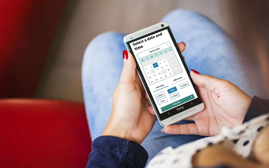
‘Book something’ pattern
To enable users to book an appointment or service request with a council service, we needed an interactive calendar with the ability to select a time.
Initially, we analysed the user needs for how our users currently booked something on our website and any future user needs we needed to think about. There were 3 main user needs to consider for this pattern:
- A user wants to see the next available date (for example booking an appointment)
- A user has a specific date they want (for example booking a trip)
- A user wants to view between two date ranges (a future ‘need’ to address)
Next, we started to design some initial ideas and then took prototypes out to test with our users. We designed three different ways to book something and gave each user the same task to complete for each design.
One of the issues we had to solve from our current booking method, was that users had to click on a date first, for it to then state that the date was unavailable. This wasn’t a good user journey and could cause frustration when a user wanted to find an available date quickly. So, we knew that we needed the calendar to be able to show unavailable dates.
As the majority of our user needs were to allow users to book a date and time for an appointment, we needed to make sure that we created a design which made this quick and easy to do. We made an assumption that by having the calendar component on the same page as the time selection it would make this an easier process, and this was validated by the user research.
From the feedback it was clear to see which design met the needs of both the business and our users.
Our main user research findings from this design showed that:
- all users selected the correct date
- users liked that they could select the date and time on the same page
- users liked seeing unavailable dates
This design tested well with our users and they found it simple to use and completed the tasks with ease. Out of the 3 designs we tested, it proved to be the most valuable in its benefits to both user and business needs. Our developers have made changes to our booking system to improve its performance, and the front-end of the Book design will be developed next.
‘Pay for something’ pattern
As we use a third-party payment system, the requirements needed for our ‘Pay for something’ pattern was to make the journey clear and understandable. We needed to improve the information on the pages that the user sees before they pay (using the payment system) and what information they see afterwards to confirm the payment.
This pattern needed to inform the user when they are about to make a payment and to be notified of a successful or unsuccessful payment.
The pattern consists of:
- the handover to the third-party payment system
- the success of a payment
- the failure of payments, including payment declined or service error
For this pattern we needed to focus on the information that we gave the user at each of these points, so we worked with our content designers to make sure that the content was clear, understandable and given at the right time.
One of the issues we had to solve for this pattern was that our payment system looked different to the style and brand of the website, so we needed to design a ‘handover’ page to inform the user that they were about to go to a payment system. Informing the user before making a payment would help to build trust and confidence when going to a third-party payment page.
We also needed to create content for any payment errors and for successful payments.
The errors we needed to explain to users were:
- unexpected technical error with the service or website
- when a user’s payment process has failed
Again, we worked with content designers to set some rules around what we needed to tell the user at each of these situations. For when a payment is declined, we wanted to reassure the user that no money was taken and give them the decision to either contact their bank or go back to try the payment again.
The success page would need to reassure users that they have completed a transaction, tell them what they need to do next and include any information that they may need, such as a payment reference number, if there is one. The content may vary depending on the service, but the pattern sets a rule that it must include this information on the success page.
Next steps
Our next step is to continue the work on the ‘Document upload’ and ‘Report an asset’ patterns and test the prototypes. Through user feedback and analytics, we can continue to monitor how well components and patterns across the site are performing and if anything needs adapting to meet new requirements. When we’ve collated user feedback, we can share our findings with the GOV.UK Design System.
The GOV.UK Design System is open source which means that it can be downloaded, used and changed by anyone so that it can be used to create consistent products and services. There’s also a cross-government community of creators and contributors. A Design System working group then review component and pattern contributions to make sure that they meet certain criteria and user needs. And as we’re benefiting from the collective knowledge and user research that has helped build it, we should share our contributions from our user research findings too.
Our pattern library is ever evolving to make sure we’re meeting the needs of our users. We can set rules and standards to follow to ensure speed and consistency, but we need to allow for adaptations to meet future needs.
For regular updates from the #DigitalStockport blog sign up for email alerts.